Collects statistical information gleaned from the latest fact-finding technologies to provide accessible comparisons of different regions of the world, in a volume of maps that covers a wide range of topics, from literacy rates and health indicators to television viewing practices and endangered species listings.
Features maps and statistics about different aspects of the world's population, covering topics that range from literacy rates and health indicators to television viewing practices and endangered species listings.
Here, sophisticated software combines with comprehensive analysis of every aspect of life to represent the world as it really is. Digitally modified maps - known as cartograms - depict the areas and countries of the world not by their physical size, but by their demographic importance on a vast range of subjects, ranging from basic data on population, health, wealth and occupation to how many toys we import and who's eating their vegetables.
366 full-color cartographic maps cover a vast array of subjects, providing a definitive reference on how regions and countries compare in resources, production, consumption, and more.
Advances in technology have made widespread and detailed data gathering easier, resulting in a deluge of statistics on subjects as diverse as literacy rates, military spending, overweight children, television viewing figures, and endangered species. But how do we represent and compare data from one part of the world to another in a useful way Here, sophisticated software combined with comprehensive analysis of every aspect of life represents the world as it really is. Digitally modified maps depict the areas and countries of the world not by their physical size but by their demographic importance on a vast range of topics.
The rainforests of South America, with thirty percent of the world's fresh water, make the continent balloon in an analysis of water resources, whereas Kuwait, dependent on desalinated seawater, disappears from the map. Fuel use, alcohol consumption, population, malaria: here are hundreds of key indicators to the way we live.
This innovative and exceptionally accessible reference work will be an indispensable tool for journalists, economists, marketers, politicians, financiers, environmentalists, and scholars. Its cartograms are augmented by graphs, tables, and full commentaries.
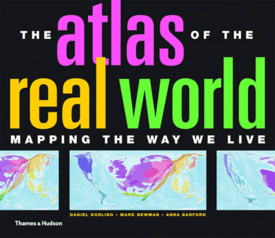
Advances in technology have made widespread and detailed data gathering easier, resulting in a deluge of statistics on subjects as diverse as literacy rates, military spending, overweight children, television viewing figures, and endangered species. But how do we represent and compare data from one part of the world to another in a useful way? Here, sophisticated software combined with comprehensive analysis of every aspect of life represents the world as it really is. Digitally modified maps depict the areas and countries of the world not by their physical size but by their demographic importance on a vast range of topics.The rainforests of South America, with thirty percent of the world's fresh water, make the continent balloon in an analysis of water resources, whereas Kuwait, dependent on desalinated seawater, disappears from the map. Fuel use, alcohol consumption, population, malaria: here are hundreds of key indicators to the way we live.This innovative and exceptionally accessible reference work will be an indispensable tool for journalists, economists, marketers, politicians, financiers, environmentalists, and scholars. Its cartograms are augmented by graphs, tables, and full commentaries.